
A brief look back at two of my favorite logo projects: refining the eccentricities of the Variety nameplate, and adding rhythm and clarity to WWD's three letterforms.
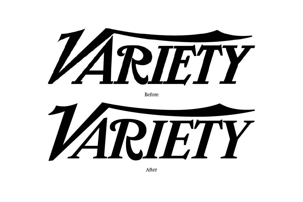
By 2013, the Variety logo was long over-due for a face lift (108 years to be exact). The stylish yet wonky letterforms created an instantly recognizable word mark (primarily due to the flying V and the curly R), but little effort had ever been made to make these shapes work well together as a whole. I called up Jim Parkinson to resolve five glaring problems: scale (the extra large A and diminutive R, condensed E and T), spacing (squished IET), perspective (the R is falling backwards), balance (where to begin!?), and the inconsistent terminals seen in the various swashes and serifs (some sharp points, some flat, others rounded). The new logo appears more refined and confident while preserving the original character and visual equity of the previous mark.

Previous logo (left) on the old daily edition and the newly redrawn logo (right) on the weekly magazine.

Originally set in blackletter as 'Women's Wear Daily', the fashion trade paper (now simply called WWD) started using Swiss Extra Compressed in the mid 90's for their logo, crashing the letters into one another to create an awkward mashup of varying stroke weights and negative spaces. Using Cyrus Highsmith's Salvo Sans as a starting point, I linked the W's to create a continuous zig-zag pattern and tucked the D in slightly on the end to balance the negative spaces. I then experimented with tints and shades of color to create a zipper pattern which created depth and a bit of fun . . . until Christian Schwartz laughed upon seeing this and suggested that I couldn't be seriously considering it. I quickly added gaps between each letter and sent the sketch off to Jesse Regan who tweaked the proportions a bit and rebalanced the counter forms. The new logo is clearer, allowing each letter to be visible on its own, and stronger as a more cohesive structure.

Rejected 'zipper' pattern logo. The red D found a home in the digital daily and printed fashion week editions as a way to emphasize the daily frequency. The weekly magazine uses a solid black or white version.

One of the final printed daily editions (left) — before the launch of the new weekly magazine — using the Swiss 911 Extra Condensed logo. The new logo on two fashion week dailies (right).

Weekly magazine featuring the new logo, February 2016.