
November Watches & Jewelry Cover

October Success Issue

September Style Cover

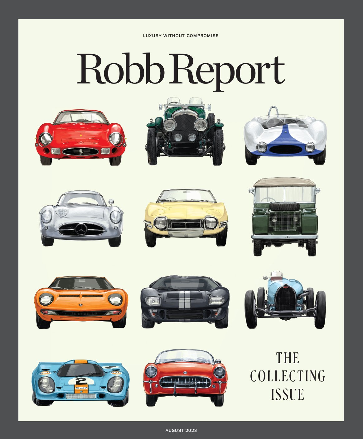
August Collecting Issue
Robb Report Broadsheet (SXSW Edition)

November Watches and Jewelry Cover

February Car of the Year Issue

September Style Issue of Robb Report
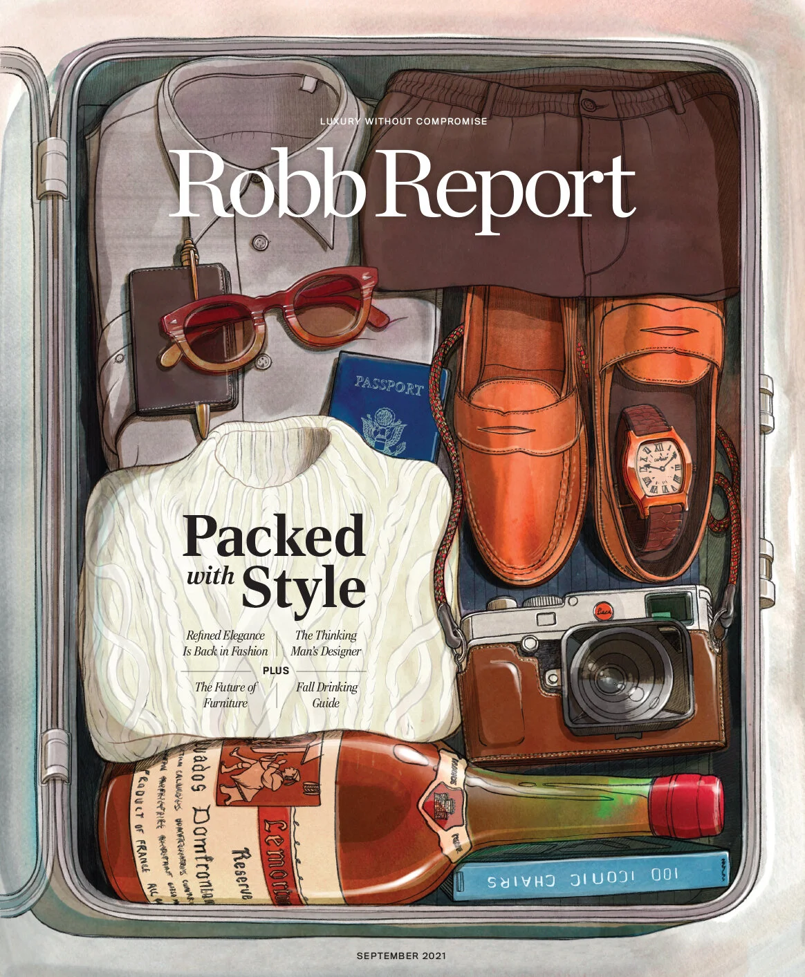
Illustration by Will Barras
Car of the Year 2021


Opening spreads to Robb Report’s 36-page Car of the Year portfolio, photographed by me in Paso Robles, CA
Robb Report November 2020

Illustration by Sam Hadley
Robb Report June/July 2020

Cover Illustration by Vasava
Robb Report November

Illustration by Vasava
Robb Report October

Illustration by Pietari Posti
Robb Report April

The California Issue, illustrated by Pietari Posti
Robb Report February

With Lamborghini winning for the second year in a row, I thought it would be fun to revisit last year’s cover and see our collector and his family receiving the Urus up in their mountain home. Illustration by Mattheiu Forichon
Robb Report November

Illustration by Mads Berg
Robb Report October

New Magazine Launch: Muse

Cover Illustration by Alberto Seveso
Febuary Cover

Illustration by Matthieu Forichon