

Illustration by Jonny Wan
New Work: Redesign of Robb Report
This time it's personal!

Illustration by Vasava
New Work: Footwear News

Illustrations by Rob Ball

Front-of-Book

Back-of-Book section, The List.
Throwback Thursday: A Pair of 100-Year-Old Logos
A brief look back at two of my favorite logo projects: refining the eccentricities of the Variety nameplate, and adding rhythm and clarity to WWD's three letterforms.
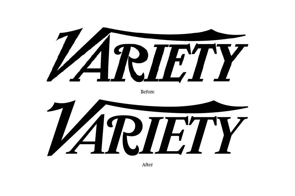
By 2013, the Variety logo was long over-due for a face lift (108 years to be exact). The stylish yet wonky letterforms created an instantly recognizable word mark (primarily due to the flying V and the curly R), but little effort had ever been made to make these shapes work well together as a whole. I called up Jim Parkinson to resolve five glaring problems: scale (the extra large A and diminutive R, condensed E and T), spacing (squished IET), perspective (the R is falling backwards), balance (where to begin!?), and the inconsistent terminals seen in the various swashes and serifs (some sharp points, some flat, others rounded). The new logo appears more refined and confident while preserving the original character and visual equity of the previous mark.

Previous logo (left) on the old daily edition and the newly redrawn logo (right) on the weekly magazine.

Originally set in blackletter as 'Women's Wear Daily', the fashion trade paper (now simply called WWD) started using Swiss Extra Compressed in the mid 90's for their logo, crashing the letters into one another to create an awkward mashup of varying stroke weights and negative spaces. Using Cyrus Highsmith's Salvo Sans as a starting point, I linked the W's to create a continuous zig-zag pattern and tucked the D in slightly on the end to balance the negative spaces. I then experimented with tints and shades of color to create a zipper pattern which created depth and a bit of fun . . . until Christian Schwartz laughed upon seeing this and suggested that I couldn't be seriously considering it. I quickly added gaps between each letter and sent the sketch off to Jesse Regan who tweaked the proportions a bit and rebalanced the counter forms. The new logo is clearer, allowing each letter to be visible on its own, and stronger as a more cohesive structure.

Rejected 'zipper' pattern logo. The red D found a home in the digital daily and printed fashion week editions as a way to emphasize the daily frequency. The weekly magazine uses a solid black or white version.

One of the final printed daily editions (left) — before the launch of the new weekly magazine — using the Swiss 911 Extra Condensed logo. The new logo on two fashion week dailies (right).

Weekly magazine featuring the new logo, February 2016.
New Work: Footwear News Spy
While working on an update to my 2014 redesign of Footwear News (check back here this Fall), I was given the chance to consult on this summer's issue of FN Spy featuring Disney dynamo and millennial fashion phenomenon Zendaya.


One Year Later: Favorite WWD Covers
Hard to believe it's already been a year since launching WWD magazine. 48 issues in, here are my favorite covers:
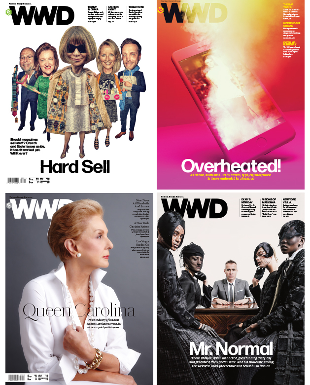
New Work: WWD Issue 44

Photograph by David Urbanke
New Work: WWD Issue 38

Carolina Herrera photographed by Nigel Parry in her New York office.
New Work: WWD Issue 36

Kerry Washington photographed by Art Streiber
New Work: WWD Issue 33
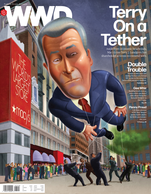
Macy's CEO Terry Lundgren, illustrated as a parade balloon controlled by investors by John Berkeley.
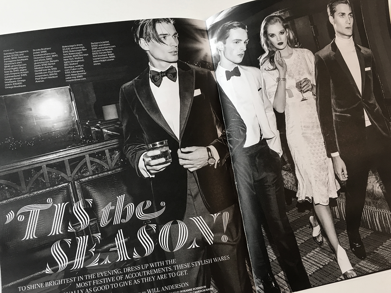
New Work: WWD Issue 31
WWD's first holiday gift guide! Fashion photography by Eli Schmidt, still photography by Will Anderson and Corey Olsen. Festive typography set in Dala Prisma by Commercial Type.

Photograph by Eli Schmidt. Headline set in Commercial Type's Dala Prisma

Still photography by Will Anderson


Photograph by Corey Olsen
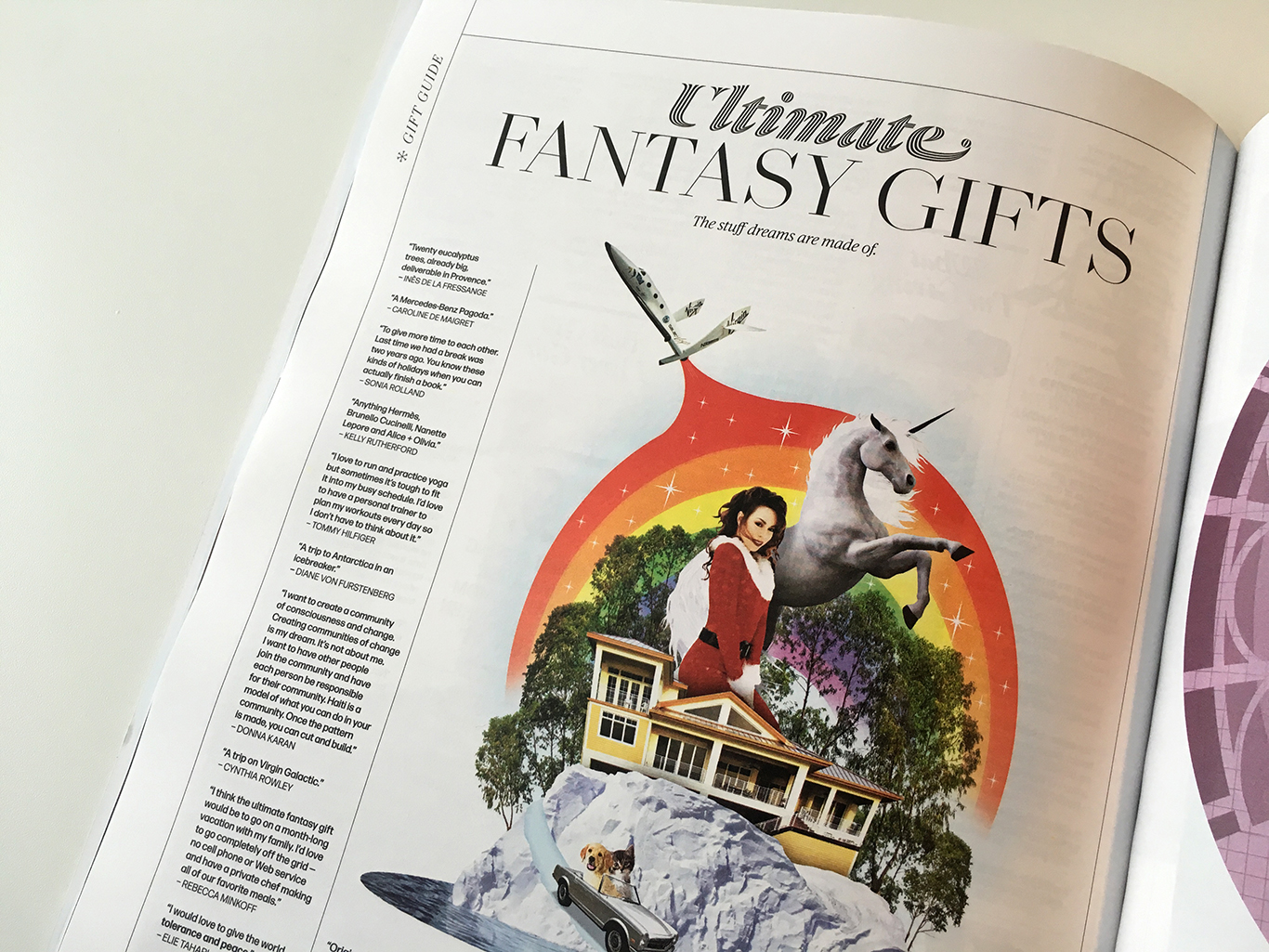
Illustration by John Ueland
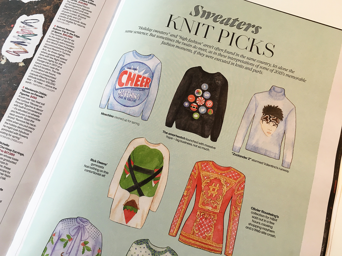
Memorable fashion moments of 2015 as holiday sweaters. Illustration by Megann Stephenson

That time Dali tossed a bathtub through a Christmas window display . . .

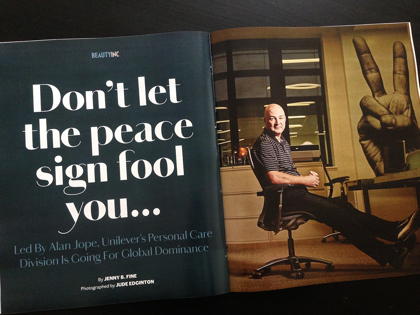
New Work: Beauty Inc (Awards Issue)
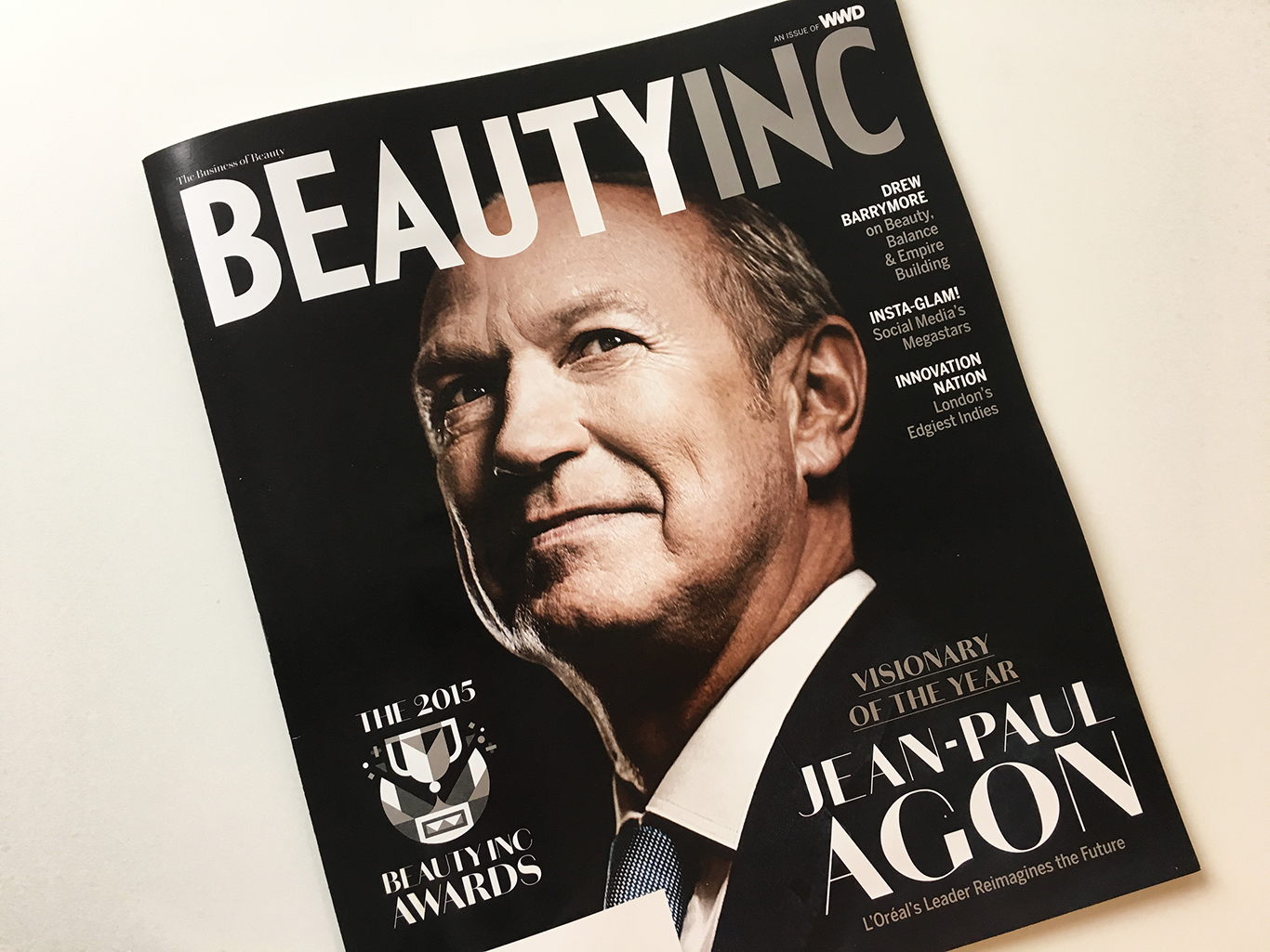
Portrait by Mark Mann


Photographs by Claire Benoist

Photograph by Claire Benoist
New Work: WWD Issue 30

Photographed by An Le
New Work: WWD Collections
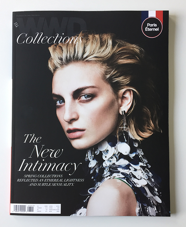
The New Intimacy, photographed by Billy Kidd.
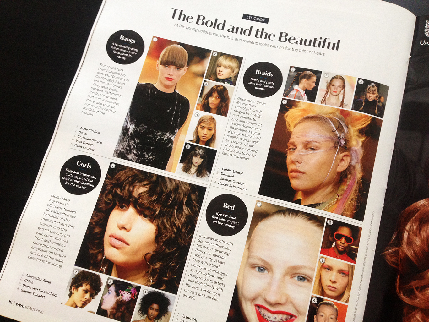
New Work: Beauty Inc. Redesign
The new issue of Beauty Inc. is out today, completing a redesign trifecta of the Fairchild print products (Footwear News and WWD relaunched earlier this year). The Beauty Inc. update features a new type palette starring Commercial Type's unreleased Chiswick Sans and the Font Bureau's Benton Sans.
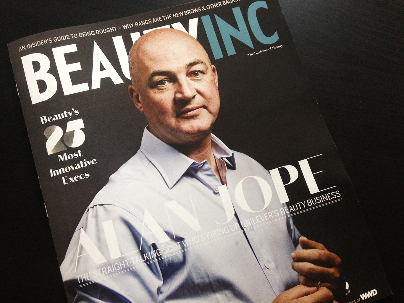
Unilever President Alan Jope, photographed by Jude Edginton.

Front-of-book opener, photographed by Claire Benoist
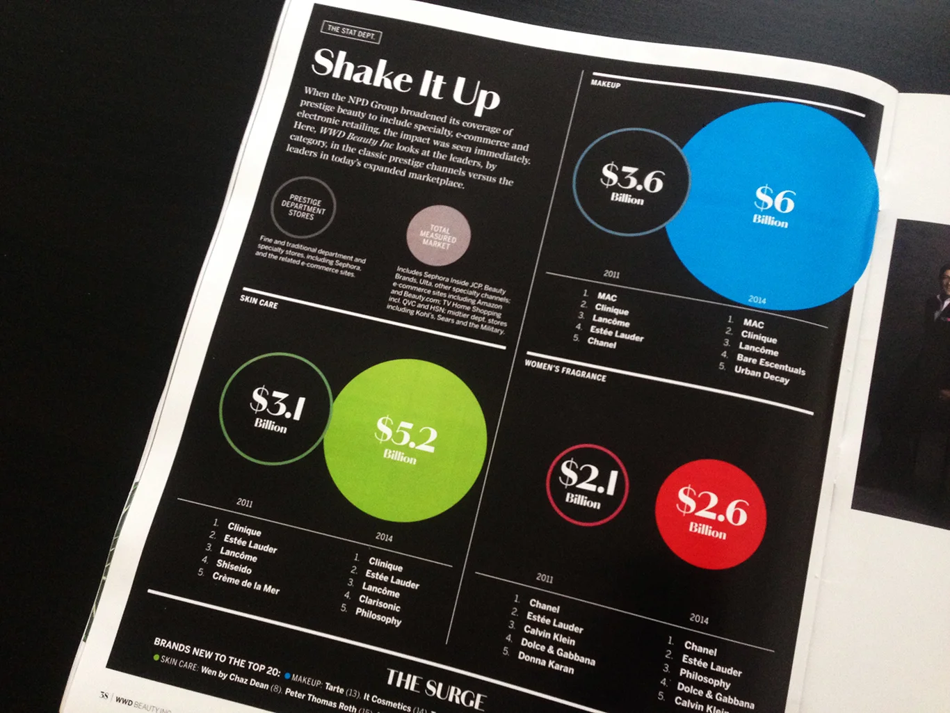
Back-of-book data page
New Work: WWD Issue 24

Illustration by Javier Jaen
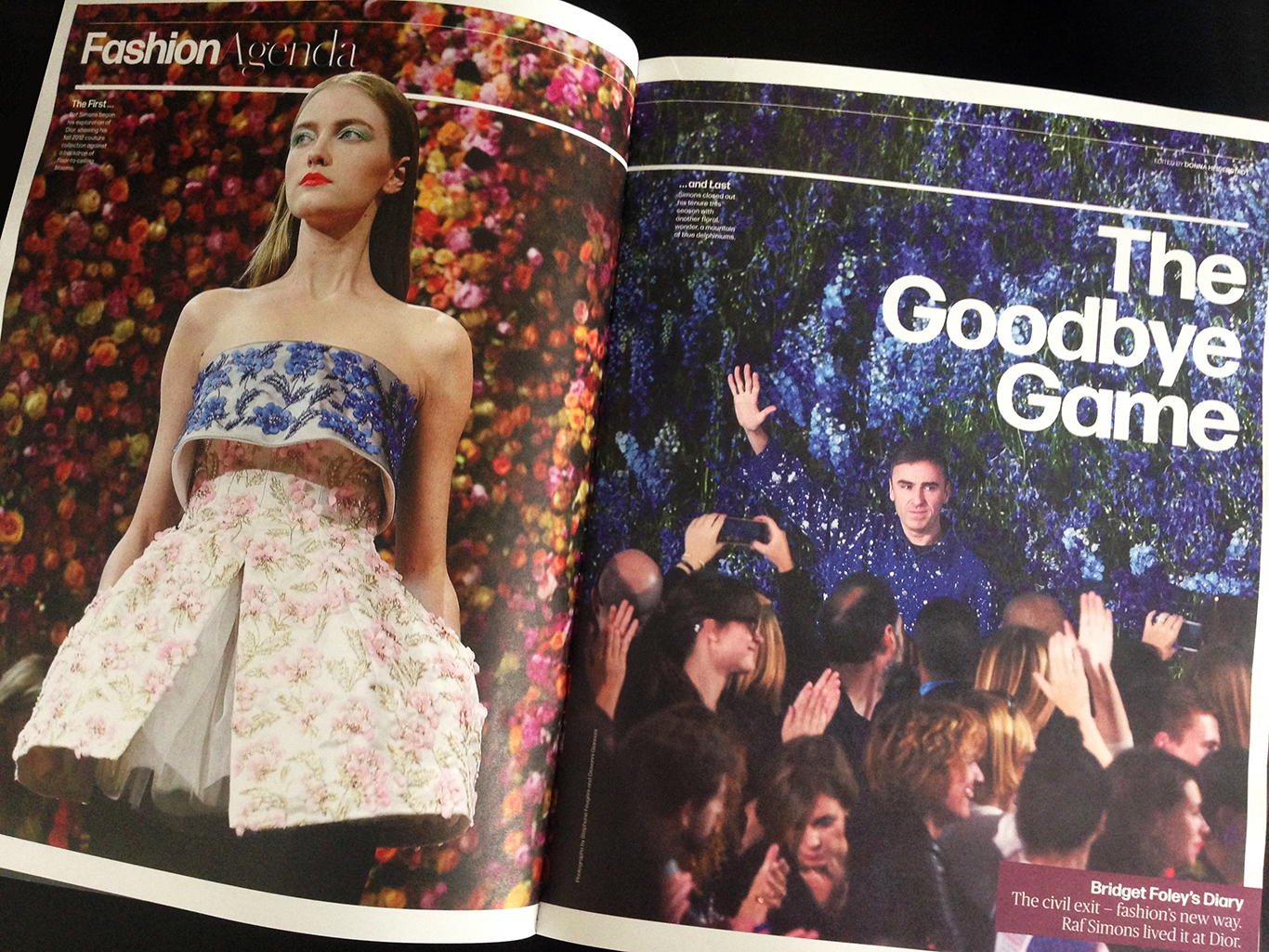
Raf Simons departs Dior. Layout by Nick Mrozowski
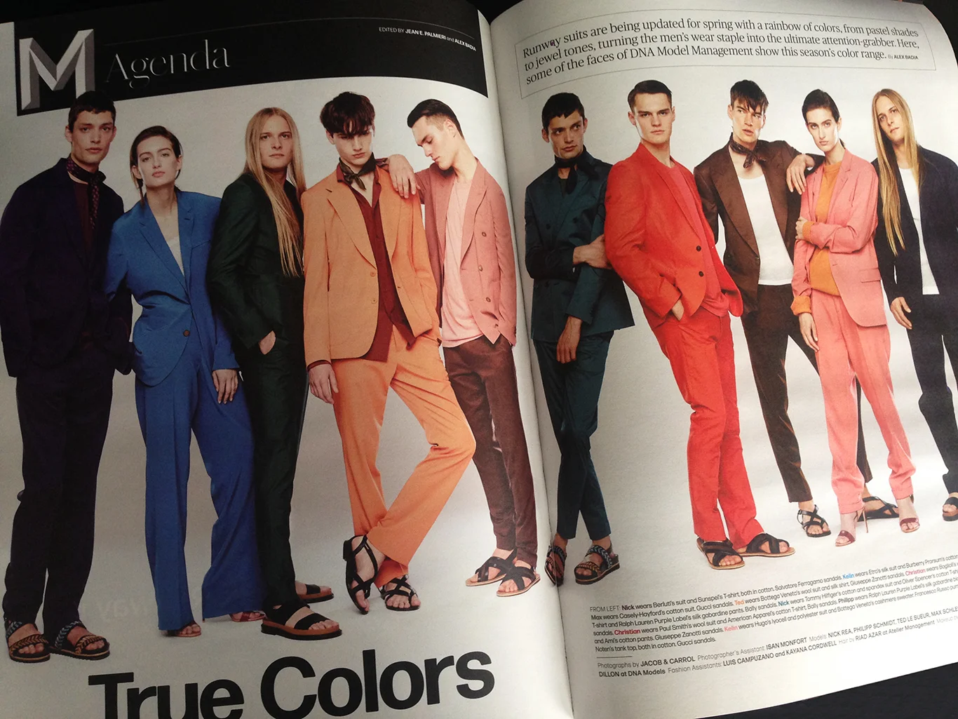
The season's rainbow of suit colors, photographed by Jacob & Carrol. Styled by Alex Badia, layout by Nick Mrozowski

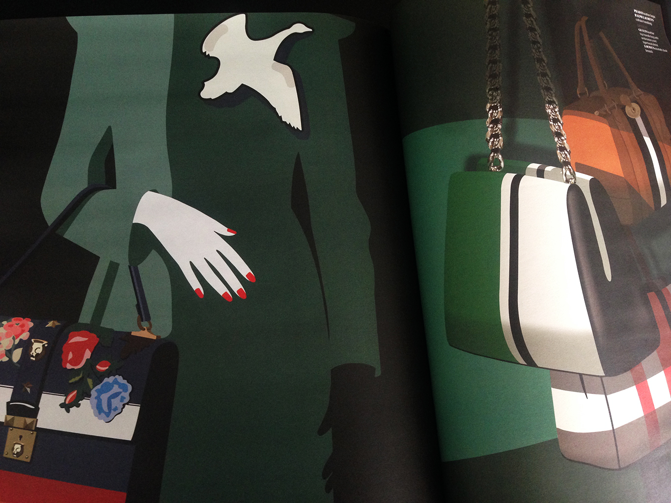
Accessories from Spring's RTW runways, illustrated by Mathilde Cretier, art directed by Nick Mrozowski
New Work: WWD Issue 20
A look from Marc Jacobs, photographed by Eli Schmidt
New Work: WWD Issue 19
Best issue yet.

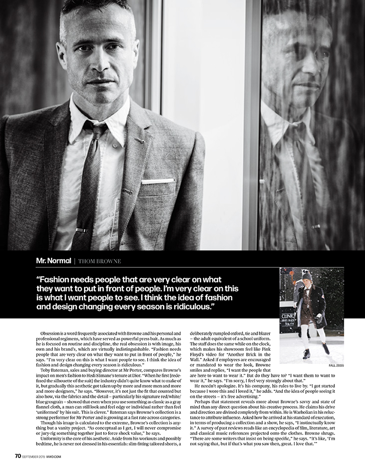
Thom Browne, photographed by Mark Mann.

Mark is the king of the 4-minute celebrity portrait, but give him 45-minutes and a cooperative subject . . .


Designer sketches for Madonna's upcoming tour. Layout by Nick Mrozowski

Layout by Gino Chua

Public School, photographed by Peter Ash Lee
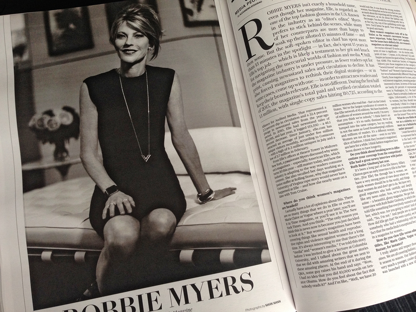
Robbie Myers, editor in chief of Elle. Photographed by Mark Mann
Layout by Nick Mrozowski

New Work: WWD Issue 18
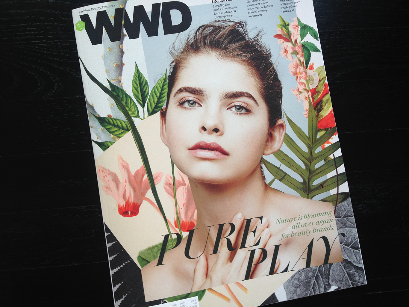
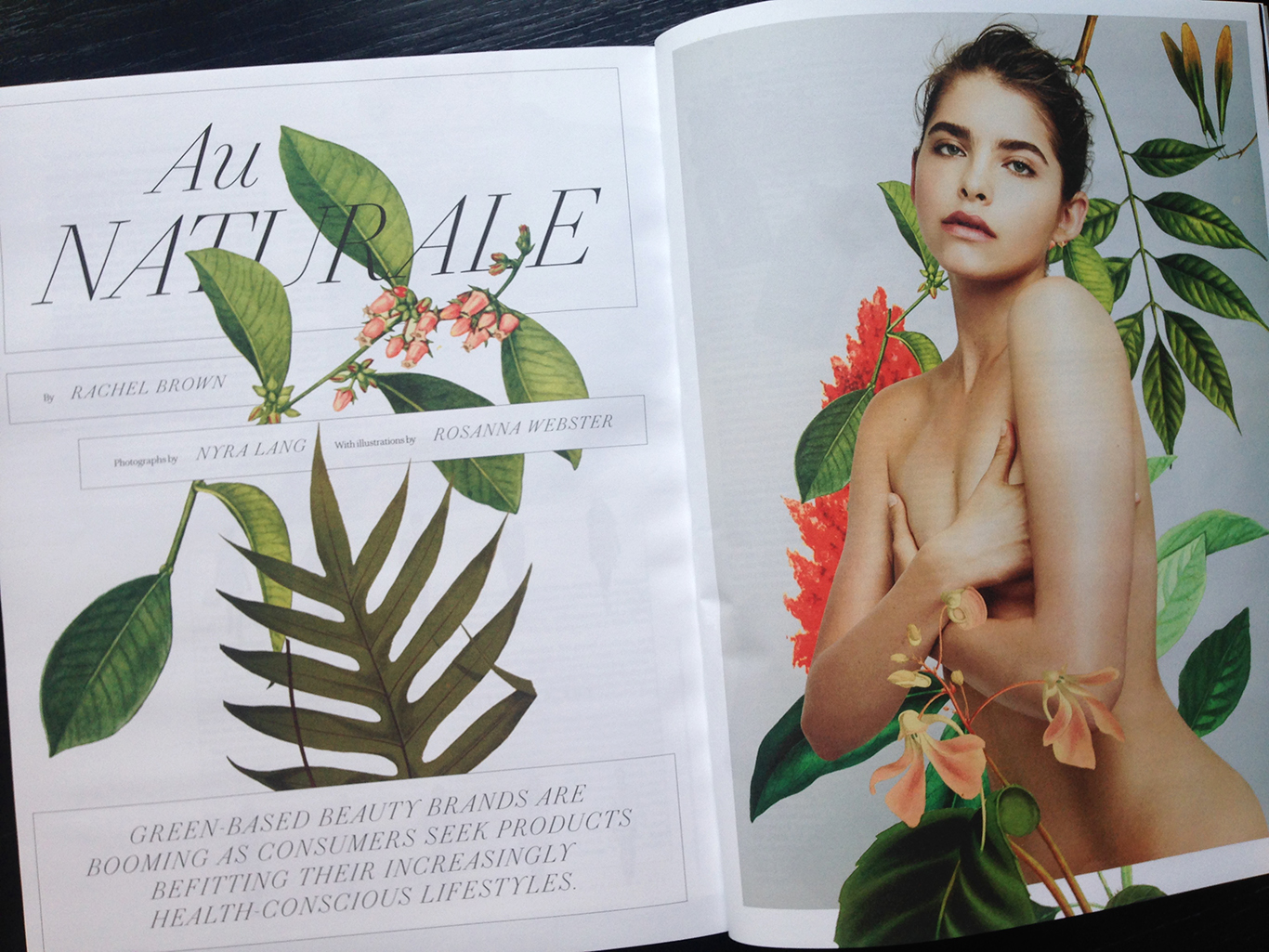
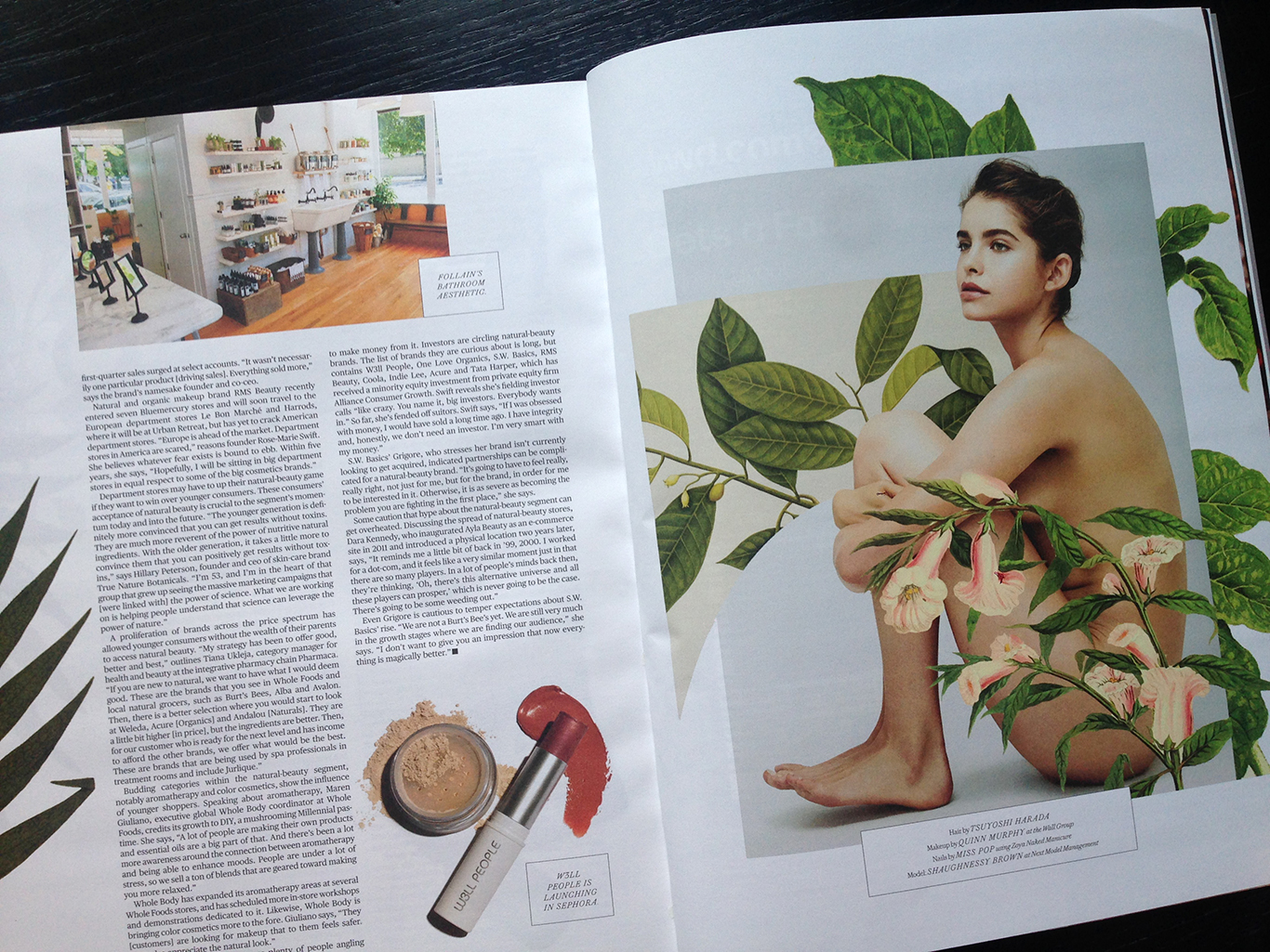
Digital Collage Rosanna Webster, Photograph by Nyra Lang
Layout by Nick Mrozowski
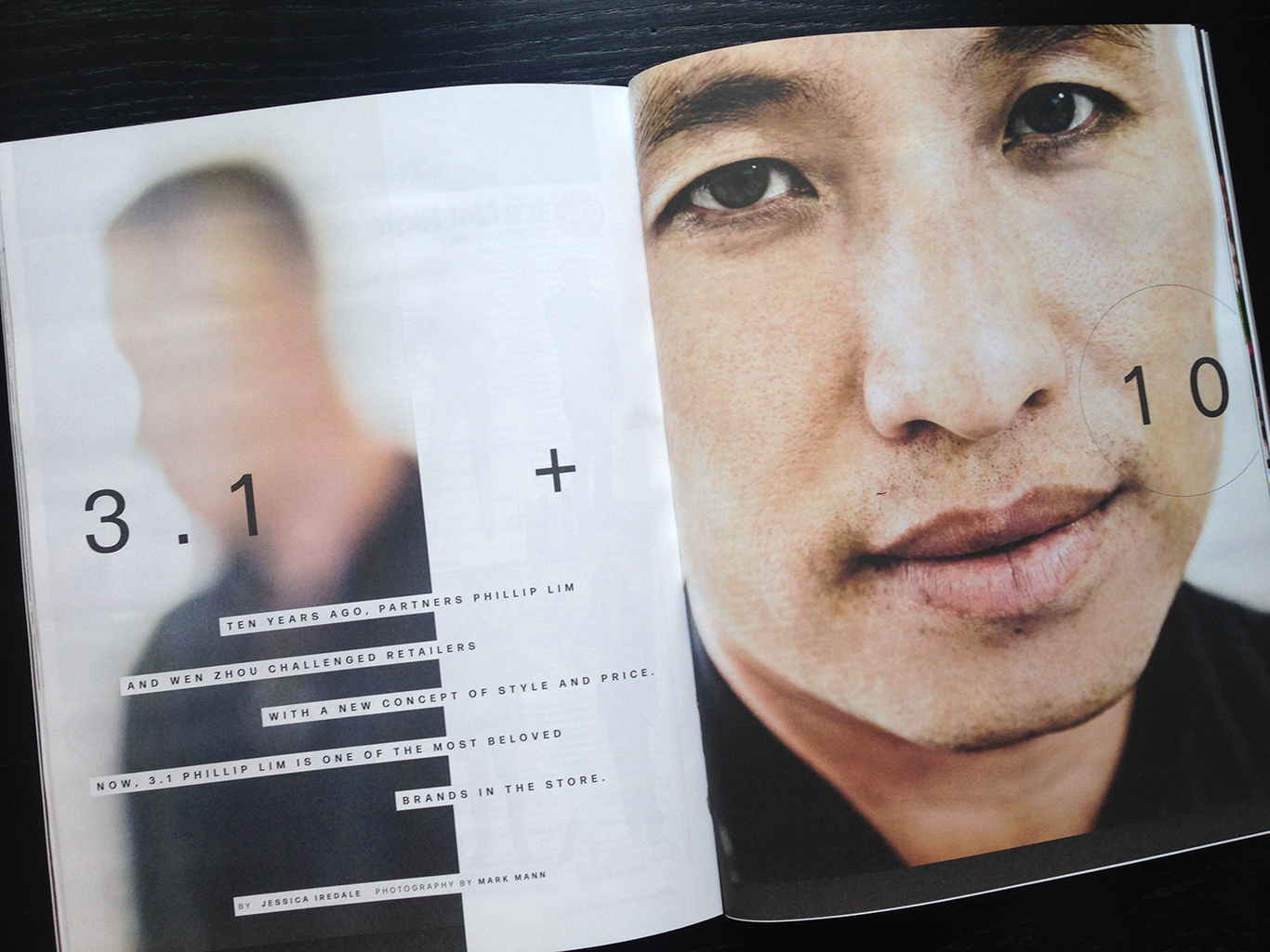
Phillip Lim, photographed by Mark Mann. Layout by Christa Guerra
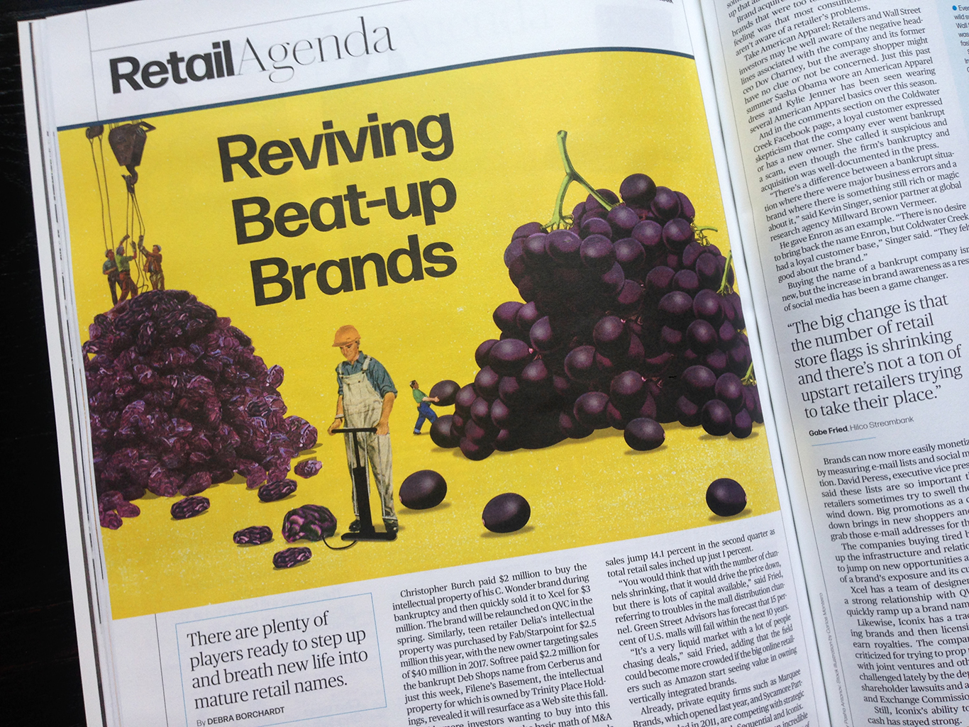
Illustration by Matthew Billington
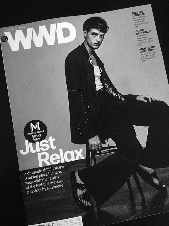
New Work: WWD Issue 17
Special M Collections Issue . . .
Photography by David Urbanke

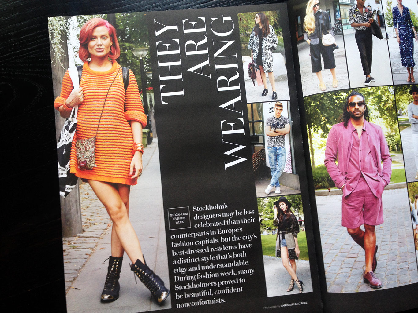
Slouchy fashion featuring a relaxed 'g'


Sir Paul Smith, photograph by Kate Peters

